Featured case studies


This section is part of an ongoing site rebuild, with additional work being added to better reflect multi-channel campaigns and brand identity projects.
Infographics and explainer-led visuals designed to break down complex information into clear, digestible formats. With experience across explainer videos and LMS content, my focus is on reducing cognitive load through thoughtful structure, clear hierarchy, and considered visual storytelling.
I specialise in breaking down complex information into clear, engaging visual stories. From internal data visualisation to customer-facing graphics, I’ve created infographics that support brand narratives and simplify decision-making. During my time at Go.Compare and Staysure Group, I often worked on visual frameworks that combined illustration and UI thinking to make abstract concepts easily digestible — whether for web, email, or print use.

With a strong foundation in both storytelling and commercial design, I bring a unique perspective to print work. My background as a comic book artist honed my eye for narrative flow and composition, which I’ve since applied to everything from large-scale advertising campaigns to branded event materials. Whether it’s promotional posters, editorial layouts, or packaging assets, I focus on creating print designs that are both visually impactful and strategically aligned with brand messaging.


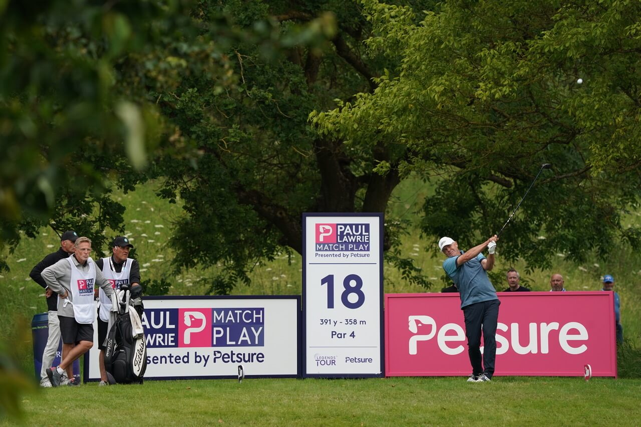
My most recent and undoubtedly favourite large-scale creative print project has been the signage I designed for the Legends Golf Tour 2024.The background to this project is that Petsure proudly sponsored the event. To celebrate, spectators were encouraged to bring their dogs along to enjoy the tournament. This meant we needed specific signage, including rules and reminders about pet care and training, boards to promote our visiting pet behaviourist, and some brand awareness posters.


Here’s a sample of a small series of posters we had at the event, offering useful tips to dog owners for teaching their four-legged friends some helpful cues.
Each poster was thoughtfully designed to be both informative and visually appealing, ensuring that pet owners could quickly and comfortably grasp the key points of the posters while enjoying the design. We used a mix of Petsure's bold brand colours, playful illustrations and images of very good boys and girls!


Seeing my work displayed at such a big event is really exciting!
And it's made even better because Petsure has some great branding assets to work with. I love using illustrations to add personality to designs. I made sure each board had a touch of cheekiness to keep things cohesive.
The training boards were definitely the most enjoyable part for me. It challenged me to think about how to make them different from the others. While other boards were informative, these were educational, going deeper to really teach a skill. We kept the design and text simple to keep the focus on the main points without being too overwhelming.
Social media
Social-first creatives designed for paid and organic channels, combining clear messaging, strong visual hooks, and adaptable formats to support performance across digital touchpoints.
(Click the images to enlarge them)